News Design

J4500/7500 Advanced Editing and News Design – Spring 2012

Andrea Piamonte’s critiques

by apiamonte

Bon Appetit has always been one of my favorite magazines. They have a very atypical look about them, especially for a food magazine. They use zoomed in pictures and interesting crops on their covers to demonstrate their features. This month, they had a feature focused in Paris. Here it is:


Image\]\


Paris… people usually think of loaves of bread and they featured just that. The cover typically also has the starburst badge to show tips or what issue it is. Their sell lines are always clean and they try not to interrupt the cover photograph. Their choices in typography are very modern (usually bold sans serifs) that give the whole magazine a clean and classy look. They tended to combine the bold sans serifs with a thinner, cleaner san serif.  In addition, their logo is in a slab serif font (one of my favorites) and gives the magazine a unique personality. I recently visited Bon Appetit on my trip to New York and let me tell you, their offices were absolutely amazing. I got the opportunity to visit their testing kitchen, photo shoot area and their design offices. It was a once-in-a-lifetime opportunity.

With the design offices, they showed me the different techniques they used to make sure their design was clean, quirky and classy across the platforms. They placed an extreme emphasis on their photographs of food and made sure that they were absolutely perfect for the cover. If you haven’t checked out the magazine, you definitely should because they have one of the best designs I have ever seen (especially for a food magazine!). 

Andrea Piamonte’s critiques

by apiamonte

This month, I decided to talk about Good Magazine and their unique covers. Here are a few so you can get a gist of how they are designed.

Image

Image 


The magazine uses a brightly colored background and then focuses on a person in the center of the cover. Good Magazine prides themselves on not using the rule of thirds and using a close up photograph of a celebrity. The magazine typically has the bright colored background and then adapts different objects to illustrate the feature story. For example, on the red cover, they feature a woman in her natural surroundings (slightly cluttered) to demonstrate the prescription story. They use a more abstract way to portray their stories. The way that this woman is postured shows that she is tense and uncertain. The fact that they show her in her natural surroundings show that she is your “neighbor” and you can relate to her easier, which ties to the central idea behind the story.

Overall, the clean look of the magazine makes the message of the photograph clear. 

Jason’s final critiques

by jasonbrynsvold

Well, I’m going to use these final critiques to try and point out some things I learned this semester and how I could use those things to improve the two pages I’m going to be looking at.

First page (Dallas Morning News):

Click for PDF: TX_DMN

The things I notice most here are the lack of white space in the centerpiece and the unusual headline hierarchy.

While the centerpiece doesn’t look feature-y, it could still use some space around it to show that it is different than all of the other news stories and is more long form. The centerpiece itself also has a lot of other problems, starting with the overline on the photo that really isn’t that interesting. Which headline am I supposed to look at first? The one on top or the one that is more bold below the photo? I say pick one and go with it.

The headline hierarchy on the rest of the page is pretty questionable too. If you are going to strip a story across the top, it is probably pretty important. So why make the story below it on the right have a MUCH larger headline? I would understand if it was like 2 or 4 points, but this is a 10 to 15 point difference, which is a little ridiculous.

Being from Dallas, I know that the DMN runs really shallow stories, like the two downpage and the news lead strip at the top, so this is not unusual to see, but I don’t like it. Why put only 3 inches of a story on the front page? If it’s important enough to go there, the story start should be longer.

I do like the labels on every story (although those can be overused) and I like the rules between the stories. Overall, it’s a not very appealing page. A lot more could have been done.

Second page (Fort Worth Star-Telegram):

Click for PDF: TX_FWST

Wow. The first thing that stands out is the unbelievable amount of white space on both sides of the supertease. I am not a fan at all. Since the supertease takes up so much space, the editors were only able to budget 3 stories for the front, which is not good at all. They’ve got to be able to stretch that picture out and decrease the depth of the banner at the top. I know Yu Darvish is awesome, but come on.

In the centerpiece, the secondary photo cuts up the two legs of type, which I would consider a cardinal sin. A simple fix would be to bump the photo to the right and just have two normal columns of type.

The hierarchy is good after I move away from the supertease, as I move from the news lead easily to the centerpiece, where I stay for a while, then I look to the left hand column. I appreciate that a lot now, since it is not easy to do, especially with hard headline specs.

Overall, the balance of the page is good. The weight of the centerpiece is appropriate and it is given a fine amount of breathing room on the page. The photo is large and it is visually appealing. With the exception of the supertease, this page is better than the DMN.

Bullying and a perfect game

by kbrynsvold

This is a special front for the Sioux City Journal. There was a suicide recently near Sioux City, and this is the paper’s response: a full front page dedicated to an editorial about stopping bullying. I really like the design, especially for the topic it is covering. This doesn’t need to be colorful or fun or designed with any real ‘cool’ features. It just needs to be what it is. The headline is powerful. I think it takes up a lot of space, but that’s okay because it says something important. The two-column look is good, even though it makes each column pretty wide. I think from far away, it looks great, and it’s still readable up close.

The black-and-white look is good for this topic because it gives a “dark vs. light” feel to the story. It’s also a classic look for an issue that has been a problem for a long time.

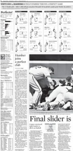
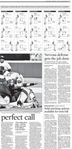
A perfect game is a rare thing, as you might guess. Philip Humber, a pretty unknown pitcher, threw the 21st in baseball history Saturday for the White Sox vs. the Mariners. This doubletruck in the Chicago Tribune tells the story of the perfect game in a great way. The infographic that spreads across the top of the doubletruck shows where Humber threw all of his pitches to each of the 27 batters he faced. As a baseball fan, I’d spend a lot of time analyzing that information in the way it is presented. Very cool. Other than that, the page is pretty simple. I like the content on the page, which is what this page should really be about. It’s not all about design here. Something happened, and they told the story in the correct way at the Chicago Tribune.

Design Critique – Will G.

by willguldin

Sorry this is late, I was locked out of my wordpress account last night — couldn’t remember the password.

Critique 1: This is a page from the Boston Globe. I picked this one because I’m doing some research that involves the paper’s typography and how they mirror it online. I feel like this print issue does a lot of things that the Missourian could emulate. Even though this is a five-story front, it still has creative teases above the nameplate and a bar on the side that is similar to the Wall Street Journal’s “What’s News” sidebar.

This page might be a little cluttered, but it doesn’t seem like to me. I particularly like the teases above the banner. They look clean and tease to at least three stories there. This page also has good headline hierarchy, I think and the two panel photos of Obama and Romney.

Boston Globe Page

Critique 2: The other thing I wanted to highlight, because it’s just plain cool, is this thing the New York Times did called a visual graphic. It highlights Mariano Rivera’s dominance of batters during his career. Overall this is an excellent piece of work, and I’m curious how you’d even make something like this.

One thing I didn’t like about this was that the pitch motion seemed repetitive after a while. That might be part of the point of Rivera’s single-pitch technique, but it made me wonder if that was really accurate, once they showed the scatter shot of all his pitches. That’s minor though. Really this is just awesome.

http://www.nytimes.com/interactive/2010/06/29/magazine/rivera-pitches.html

-Will


Final critiques

by yoobi55


Since posting my previous critiques, I’ve been thinking about what I should critique because I wanted my last critiques to be meaningful. And I thought it would be interesting to blog about the Missouri community newspapers that I visited this semester for my community newspaper class.


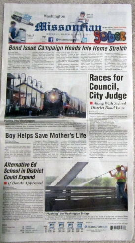
The first newspaper is Washington Missourian, which is the Franklin County paper based in Washington, Missouri. The paper is owned by the Missourian Publishing Company, a family-owned company. I think it’s a very nicely designed page that gives a local flavor. The problems that I have with this page is the focus of the page and the design of the nameplate and flag. Although I understand that the use of cropped images was necessary and it’s been done for while, I think it’s kind of overdone. To me, those cropped images even made the flag hard to recognize. In addition, I think it would’ve been better if the typeface of the nameplate was a little lighter. Secondly, I’m not really sure about hierarchy of the page. Even though that lead story, “Races for Council, City Judge,” has the biggest headline, it is still hard to see which story I should look at first because there is a story on the top and another story on the left with the biggest photo.


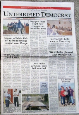
The second is Unterrified Democrat, a bi-weekly newspaper that serves Osage County. There is a funny story behind why they got the name Unterrified Democrat even though they are firm Republicans, but I’ll go straight to the critique. I like the clean and nice-looking flag and nameplate. The thing that bothers me, though, is the eight-grid column module, which makes the text a little crowded. In addition, I think it really needs some structure or style that separates stories, maybe a line that separates each story. Unless you start reading from the very left, it’s hard to just jump into the story that you want to read because it’s hard to find where the story begins.

Given that those two newspapers have a lot less budget and circulation than our Missourian, I think the little details that I pointed out might sound even a bit too arrogant. Maybe this kind of less refined quality is what makes a community newspaper look like a community newspaper.


(Apologies for the non-scanned images; I don’t own a big scanner)

– Bi


Final critques

by Alysha Love

Image

I’ve never thought much about what it would be like to design on a tabloid-sized paper; I’ve never had much need design-wise, and I never read tabloids. I found this page from the Bakersfield Californian on Newseum and found myself intrigued by it. It’s interesting how much information they’ve managed to cram onto the front page while still looking sleek, clean and spacious. They’ve even gotten an ad onto their small front without seeming to cost them anything very important. The nameplate is impressively full of information; it’s got the standard date, website and cost, but also prominently yet discreetly displays the index. They’re still able to play the photo for their centerpiece story big with headline, deck and photo caption. They’re betting that’s enough to get you to flip to the story start; that could be a gamble, depending on how engaging the content is. I like the package at the bottom that groups the other three stories together to tease into the paper. I do think that would be a challenge to write every night, especially if the stories needed some kind of link like “Trouble everywhere” to latch them together. Searching for similar content in the paper instead of the most important news could cause the front page to not hold the most relevant content for the readers. It would also be difficult to write such short refers for the stories. Overall, although the design is efficient and looks nice, I don’t think that it’s a good service for the readers when every element on the page sends you digging into the paper with very little information to go on.

I have no idea what the context for this page is aside from the fact that it’s a McDonald’s advertisement. None of the stories are about McDonald’s or anything to do with food. From what I can tell, this is a regular page that was mostly deprived of art to create what would otherwise be a text-heavy, gray page. All it took to create the advertisement was adding color to the columns with a bit of darker color for shading. The fry container at the bottom of the page gives the necessary context to make the ad clear. I love, too, that McDonald’s knows that all it needs is the tips of the arches to let everyone know that these aren’t just any fries; they’re McDonald’s fries. From the advertiser’s perspective, this is a brilliant idea to play off of the format of the newspaper in such a creative way. It’s a nearly full-page ad that’s attention-grabbing and clever. The design itself is simple to execute. However, I’m iffy on this from an editorial standpoint if all that text is indeed continued from the stories at the top of the page. On one hand, it’s awesome to be able to double up on space — to sell a 2/3 page ad but still be able to fill most of that with editorial content. On the other hand, it would feel very wrong to lend large chunks of text to an advertisement. It seems that it would be most appropriate with wire content that isn’t serious in nature but would be very wrong with local content of any consequence. Even if it were wire copy, such an intricate combination of editorial and advertising is a bit unsettling. I would like this design concept more if the page were part of a story the newspaper put together about fast food or unhealthy eating habits. Overall though, I love this concept and its execution here.

Critiques

by eelisa314

I really enjoy this section from the Indiana Daily Student (Indiana University), which I stumbled across on Charles Apple’s blog. As an avid crossword puzzler, this clever, interactive design really appeals to me. What a diversionary treat for IU students during their last week of classes, and an excellent way to tease to an interview with IU grad and puzzle master Will Shortz. I’m not sure how many students would have heard of Shortz, but I think this design is an excellent way to draw readers in. The giant IU logo hidden in the puzzle’s center shows the level of thought that went into this project. I’m not an expert on the Hoosiers, but I imagine the same attention to detail can be found in the clues (hope the answers are right!).

Also shown here is the tease to the puzzle from the front page. The tie-in with the grid is very cute, but I wish they’d made it look even more like a crossword puzzle (ie. no random spaces, use of clue numbers). A lot of thought clearly went into this design, and I only wish they’d taken it all the way in both the actual design and the tease.

********************************************************************************************************************

For my second critique, I’ve chosen this sports front from the Chicago Tribune, also from Apple’s blog. This page is very different from most everything I’ve seen — especially with regards to the very vertical photo. I think it’s a very interesting choice, and I like it here, though since I’m not a regular reader of the Tribune, I’m not sure how often they do this and I could see it easily getting overplayed. But it’s a very dramatic treatment and an expressive photo for what was a very exciting day in MLB.

I also really respond to the use of type on top of the image (though I wonder how the page would have looked if they’d used a massive cut out instead). I think the photo is big and bold enough that the type doesn’t overpower it. The touches of red are also subtle and sparing enough not to distract from the image. I do find myself wishing the text at the top (near his face) were a bit more symmetrical and not cutting in as close. I think everything below his mitt is well sized and well placed.

Final round of critiques

by danramey1

The first page for my final critique is this one from the Star Advertiser in Honolulu.  First off, I really like the lead package as it immediately grabs my attention. The headline is big and seems to demand an appropriate amount of attention considering how big the package is.  I also like the little graphic that explains the drilling process. Overall, I find this package really compelling and it gets me interested in the story, even though I normally wouldn’t give a story about drilling a second look.  My one problem is the teases just below the headline on the right side of the story.  They have absolutely nothing to do with the package, yet their placement on the page suggests that they are part of the package. I wonder if the teases were absolutely necessary, or if they could have placed them somewhere else (maybe above the flag or something).

The second page is from the Sunday San Jose Mercury Times.  I really like the lead illustration for this page.  I really like how the illustration drives the point of the story (sort of that everyone’s dragging behind apple) in a very simple way.  The cartoony nature of the illustration also draws my attention and interest very easily. Overall, it’s a very appealing package.

-Danny

TRES

by Alysha Love


My third set of critiques are a complete ode to creativity.


"Font" chairs -- TABISSO lounge furniture is a collection of typographic furniture objects that allow you to freely communicate names, acronyms’ or any personalized message by displaying chairs and floor lamps side by side.


TABISSO CHAIRS

THESE ARE FONT CHAIRS. Yes, you read that correctly. Some GENIUS decided to create chairs out of letters and numbers that seem to be comfortable and practical. And, amazingly enough, they’re all clearly readable. They’d be great for cute messages — like “MARRY ME?” — or for advertising — “PANERA” or “J-SCHOOL.” What’s that? You’d need punctuation for those? Why, yes, you would. And these French designers thought about that, too. They’ve got a full line of punctuation lamps to accompany the chairs. Brilliant.

I think the chairs end up looking surprisingly sleek and modern considering how wide each character must be in order to make it wide enough to sit on. It’s also a pretty incredible feat to create chairs that are actually functional while still readable. Unfortunately, these are custom made in France, so they probably cost a fortune.


Harry Potter Character Font

Albus Dumbledore, Sirius Black, Cho Chang, Draco Malfoy, Dobby the Elf, Argus Filch, Hermione Granger, Rubeus Hagrid, Igor Karkaroff, James Potter, Kingsley Shacklebolt, Bellatrix Lestrange, Alastor “Mad-Eye” Moody, Neville Longbottom, Garrick Ollivander, Harry Potter, Quirinus Quirrel, Remus Lupin, Severus Snape, Nymphadora Tonks, Dolores Umbridge, Lord Voldemort, Ron Weasley, Xenophilius Lovegood, Yaxley, Blaise Zabini

I’m going to say someone is pretty good when they can create an alphabet of recognizable characters based on a book series with a huge number of strange names. Yes, I did write those all out myself. (Then, of course, I followed the link to his website, where he has the full list right beneath the picture. FML.) This guy, Mike Boon, has done a few different creative, character-based alphabets, including Pixar, Dr. Seuss and Sesame Street.

Compared to the other alphabets he designed, the Harry Potter alphabet is much more simplistic. But, of course, it’s still getting the message across just as well as his intricate Sesame Street characters. It kind of reminds me of when I play Draw Something. I always sketch out the basic thing that I’m drawing, but then I spend another few minutes adding lots of details so my partner can guess the word more easily. The funny thing is, when I watch my partner guessing the word, he or she will usually get it right when I’ve finished sketching — before I’ve added lots of unnecessary details. I’ll sometimes do the same thing with designs by taking them a few steps further than they need to go. They end up cluttered instead of classy, and it by no means adds to the reader’s understanding or aesthetic appreciation of the page. I think Boon might have had the same kind of realization: Less is more.

I also think this alphabet speaks to knowing what key details to pick out to increase someone’s understanding. The W, for example: All he needed was red-orange hair for us to immediately know it’s a Weasley. Even lesser-known characters, such as James Potter or Blaise Zambini, who rarely appear in the movies, are recognizable because of a few traits that fans know about them. It’s just a matter of knowing what color, characteristic or detail will get the right message across.