News Design

J4500/7500 Advanced Editing and News Design – Spring 2012

Final critques

by Alysha Love

Image

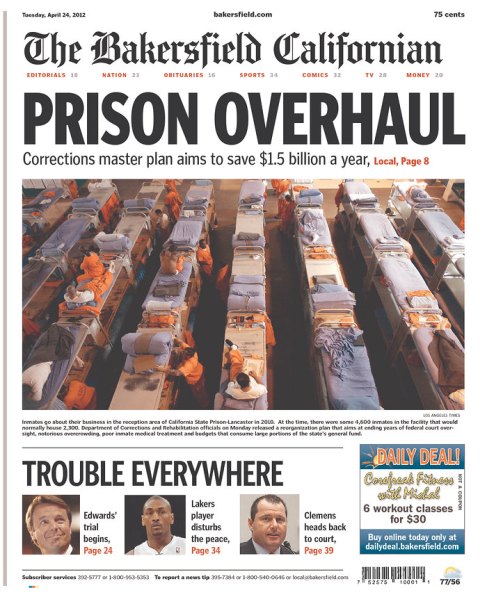
I’ve never thought much about what it would be like to design on a tabloid-sized paper; I’ve never had much need design-wise, and I never read tabloids. I found this page from the Bakersfield Californian on Newseum and found myself intrigued by it. It’s interesting how much information they’ve managed to cram onto the front page while still looking sleek, clean and spacious. They’ve even gotten an ad onto their small front without seeming to cost them anything very important. The nameplate is impressively full of information; it’s got the standard date, website and cost, but also prominently yet discreetly displays the index. They’re still able to play the photo for their centerpiece story big with headline, deck and photo caption. They’re betting that’s enough to get you to flip to the story start; that could be a gamble, depending on how engaging the content is. I like the package at the bottom that groups the other three stories together to tease into the paper. I do think that would be a challenge to write every night, especially if the stories needed some kind of link like “Trouble everywhere” to latch them together. Searching for similar content in the paper instead of the most important news could cause the front page to not hold the most relevant content for the readers. It would also be difficult to write such short refers for the stories. Overall, although the design is efficient and looks nice, I don’t think that it’s a good service for the readers when every element on the page sends you digging into the paper with very little information to go on.

I have no idea what the context for this page is aside from the fact that it’s a McDonald’s advertisement. None of the stories are about McDonald’s or anything to do with food. From what I can tell, this is a regular page that was mostly deprived of art to create what would otherwise be a text-heavy, gray page. All it took to create the advertisement was adding color to the columns with a bit of darker color for shading. The fry container at the bottom of the page gives the necessary context to make the ad clear. I love, too, that McDonald’s knows that all it needs is the tips of the arches to let everyone know that these aren’t just any fries; they’re McDonald’s fries. From the advertiser’s perspective, this is a brilliant idea to play off of the format of the newspaper in such a creative way. It’s a nearly full-page ad that’s attention-grabbing and clever. The design itself is simple to execute. However, I’m iffy on this from an editorial standpoint if all that text is indeed continued from the stories at the top of the page. On one hand, it’s awesome to be able to double up on space — to sell a 2/3 page ad but still be able to fill most of that with editorial content. On the other hand, it would feel very wrong to lend large chunks of text to an advertisement. It seems that it would be most appropriate with wire content that isn’t serious in nature but would be very wrong with local content of any consequence. Even if it were wire copy, such an intricate combination of editorial and advertising is a bit unsettling. I would like this design concept more if the page were part of a story the newspaper put together about fast food or unhealthy eating habits. Overall though, I love this concept and its execution here.
TRES

by Alysha Love


My third set of critiques are a complete ode to creativity.


"Font" chairs -- TABISSO lounge furniture is a collection of typographic furniture objects that allow you to freely communicate names, acronyms’ or any personalized message by displaying chairs and floor lamps side by side.


TABISSO CHAIRS

THESE ARE FONT CHAIRS. Yes, you read that correctly. Some GENIUS decided to create chairs out of letters and numbers that seem to be comfortable and practical. And, amazingly enough, they’re all clearly readable. They’d be great for cute messages — like “MARRY ME?” — or for advertising — “PANERA” or “J-SCHOOL.” What’s that? You’d need punctuation for those? Why, yes, you would. And these French designers thought about that, too. They’ve got a full line of punctuation lamps to accompany the chairs. Brilliant.

I think the chairs end up looking surprisingly sleek and modern considering how wide each character must be in order to make it wide enough to sit on. It’s also a pretty incredible feat to create chairs that are actually functional while still readable. Unfortunately, these are custom made in France, so they probably cost a fortune.


Harry Potter Character Font

Albus Dumbledore, Sirius Black, Cho Chang, Draco Malfoy, Dobby the Elf, Argus Filch, Hermione Granger, Rubeus Hagrid, Igor Karkaroff, James Potter, Kingsley Shacklebolt, Bellatrix Lestrange, Alastor “Mad-Eye” Moody, Neville Longbottom, Garrick Ollivander, Harry Potter, Quirinus Quirrel, Remus Lupin, Severus Snape, Nymphadora Tonks, Dolores Umbridge, Lord Voldemort, Ron Weasley, Xenophilius Lovegood, Yaxley, Blaise Zabini

I’m going to say someone is pretty good when they can create an alphabet of recognizable characters based on a book series with a huge number of strange names. Yes, I did write those all out myself. (Then, of course, I followed the link to his website, where he has the full list right beneath the picture. FML.) This guy, Mike Boon, has done a few different creative, character-based alphabets, including Pixar, Dr. Seuss and Sesame Street.

Compared to the other alphabets he designed, the Harry Potter alphabet is much more simplistic. But, of course, it’s still getting the message across just as well as his intricate Sesame Street characters. It kind of reminds me of when I play Draw Something. I always sketch out the basic thing that I’m drawing, but then I spend another few minutes adding lots of details so my partner can guess the word more easily. The funny thing is, when I watch my partner guessing the word, he or she will usually get it right when I’ve finished sketching — before I’ve added lots of unnecessary details. I’ll sometimes do the same thing with designs by taking them a few steps further than they need to go. They end up cluttered instead of classy, and it by no means adds to the reader’s understanding or aesthetic appreciation of the page. I think Boon might have had the same kind of realization: Less is more.

I also think this alphabet speaks to knowing what key details to pick out to increase someone’s understanding. The W, for example: All he needed was red-orange hair for us to immediately know it’s a Weasley. Even lesser-known characters, such as James Potter or Blaise Zambini, who rarely appear in the movies, are recognizable because of a few traits that fans know about them. It’s just a matter of knowing what color, characteristic or detail will get the right message across.


Alysha’s second batch of critiques

by Alysha Love

Inline image 2 

Inline image 1

Expresso is a Portuguese newspaper I stumbled across when looking through designs online. I really like this front page for how bold, calm, simple and clean it is. It has touches of color — the deep blue accentuated by calm shades of yellow, green, light blue, purple, pea green and red. But those colors are barely noticeable at first glace at the page. They surprisingly don’t make the page busy. Instead, once you’re already in the page, they give you nice direction, easing you in the most important stories. The amount of white space really gives the page room to breath. The interesting part is the amount of information packed on the page despite the soothing layout. There are four teasers at the top, what looks like a series of seven briefs with art along the left side, and three story starts on the righthand side. Oh, and the centerpiece with massive art and room for advertising at the bottom. I really like the functionality, as long as the rest of the newspaper is well-organized enough to handle all those jumps. Based on this inside page accompanying the cover page I found, it looks like the paper continues to do a great job packaging an incredible amount of information into a clean, airy design while maintaining its readability and functionality. Kudos.


Jessica Hische's daily drop cap project. Jessica has made the entire library freely usable for non-commercial projects.

This is another Pinterest find, from a while back. It’s the Daily Drop Cap Project from 2009 by designer and illustrator Jessica Hische. She completed 12 alphabets of cool and original drop caps for bloggers to use. I’ve spent years doodling out words and letters, doing things like making “i” into disjointed ice cream cones, drawing “s”-shaped snakes and creating intricate script letters. I have no idea where you even begin learning how to translate those kinds of ideas onto the computer, but I would love to learn how. How great would it be if I could create a clever illustration for a front page or my own fancy drop cap for a classy story? 

The risk we’d run with learning how to do drop caps would be overusing them to the point that they’re cliche or cheesy or kitch. But this — and generally creating basic illustrations for designs — is a skill I’d love to pick up.

 I love this H because it combines the plain and whimsical; the heavy stroke of the capital beautifully contrasts the light stroke of the lowercase letter. It’s clean but engaging.

 I love how happy this “Q” is. Again, it’s simple, but it’s also fun without being over-the-top or annoyingly cutesy. 

 We’re publishing a panorama on Friday about how kids aren’t able to write cursive anymore. This would be a pretty good art drop head idea to accompany a story like that. 

 I like how round this “E” is — very bubbly. It’s also visually intriguing; the white strip on the inside can play tricks on your eyes. The bold color and simplicity (no pattern to the color) make it a striking character.

 I just love this. WHO wouldn’t?

—Alysha


Alysha’s design critiques

by Alysha Love

Fort Payne, Ala. — Times-Journal

I was drawn to this page as I was looking through the Newseum website because of its strong, bold nameplate in the top left corner. I thought this was a really gutsy and original way to brand the paper and give it an updated feel. It also frees up a lot of space — the two teasers next to the nameplate get a lot of room, which means they can be more designed and seem more meaningful to the page instead of looking like an inconvenient afterthought. I think the red stripe across the bottom of the teasers nicely separates them from the rest of the content and prevents them from making the page looks cluttered. I’m not a fan of the paper’s typeface, which seems a bit too childish. Its tone doesn’t seem to fit with serious news, I think because of the curved bits on the bottom of some letters, such as L and T. I’m fascinated by the paper’s decision to justify all their headlines, decks, bylines and jumps … but I’m not sure that I like it. I think it would work better if all the columns used justified type rather than ragged type because it would give the other elements a more even space to be centered  on top of. The mugshots on the page are close to the same horizontal space on the page, but they’re just off, which is distracting. The weights of the type for the headline also seems strange to me; they’re all so heavy that I’m not sure where to look. The dummied layout of the page itself seems fine though, it was just poorly executed. The best part of this page by far is the nameplate and teasers.

Mobile, Ala. — Press-Register

I followed the Press-Register for a couple weeks during the editing/design class with Maggie because I was again drawn to the original nameplate and teaser layout at the top of the page. I’m often a fan of the paper’s layout, but I’m not today. The teaser strip below the nameplate usually pops with a colored background and creates a more distinctive separation between it, the nameplate and the news design below. However, it was resized and given a white background in today’s paper to accommodate the three-person cutout from the Alabama basketball game. It’s certainly a dynamic image, and I like that they were bold enough to cover a good part of the paper’s name with the ball. However, the rest of the design seems too busy given the action of that large cutout. I think the paper would have been better served to break its normal design layout (the three stories running vertically with the widest in the middle) in favor of running one story across the page to calm down the layout. The three different headlines, decks and two clarifying titles for the pieces just make it far too busy directly beneath a busy image. I also think there are too many rules on the page, making it again feel cluttered and jumbled instead of coherent and authoritative. On a copy editing note, I’m about to die from the use of not one but two exclamation points on the front page. Horrors.